
 Building Configurator
 Request a Quote

The Right Colour for the Right Setting
It's easy to overlook colour when specifying a building. Dimensions, cladding, insulation, access — these feel like the important decisions. But where a building sits and how it looks in its environment matters more than many buyers initially appreciate. A structure that blends naturally into a farm landscape reads very differently from one that stands out as mismatched against the surroundings. And on a commercial site or industrial estate, a building that complements the existing palette of the site looks considered and professional rather than temporary and out of place.
Kit Buildings PVC fabric buildings are available in a range of colours — giving customers the ability to choose a cover that suits their setting, whether that's an industrial environment where a clean, commercial appearance matters, or a rural location where the goal is to sit quietly in the landscape rather than draw attention.
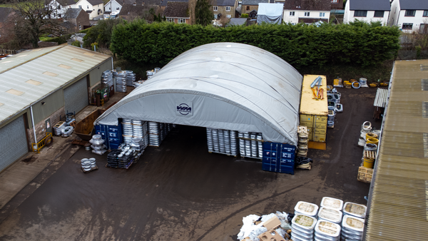
On the Industrial Estate: Looking the Part
For businesses operating on commercial sites, industrial estates, or in locations where the building will be seen by customers, neighbouring businesses, or the public, appearance carries real weight. A fabric building in the wrong colour can look like a temporary fix even when it's a permanent operational asset. The right colour choice changes that perception entirely.
Choosing a cover colour that matches or complements the existing structures on your site — whether that's the grey of steel cladding, the cream of render, or the green or blue tones of neighbouring units — makes a fabric building feel like a deliberate part of the site rather than an addition that doesn't quite belong. For businesses that invest in how their operation presents itself to the world, it's a detail worth getting right.
A branded building in your company colours takes this further — see our separate piece on logo and branding options for PVC fabric structures. But even without branding, a well-chosen cover colour goes a long way toward making a fabric building look at home on a professional site.
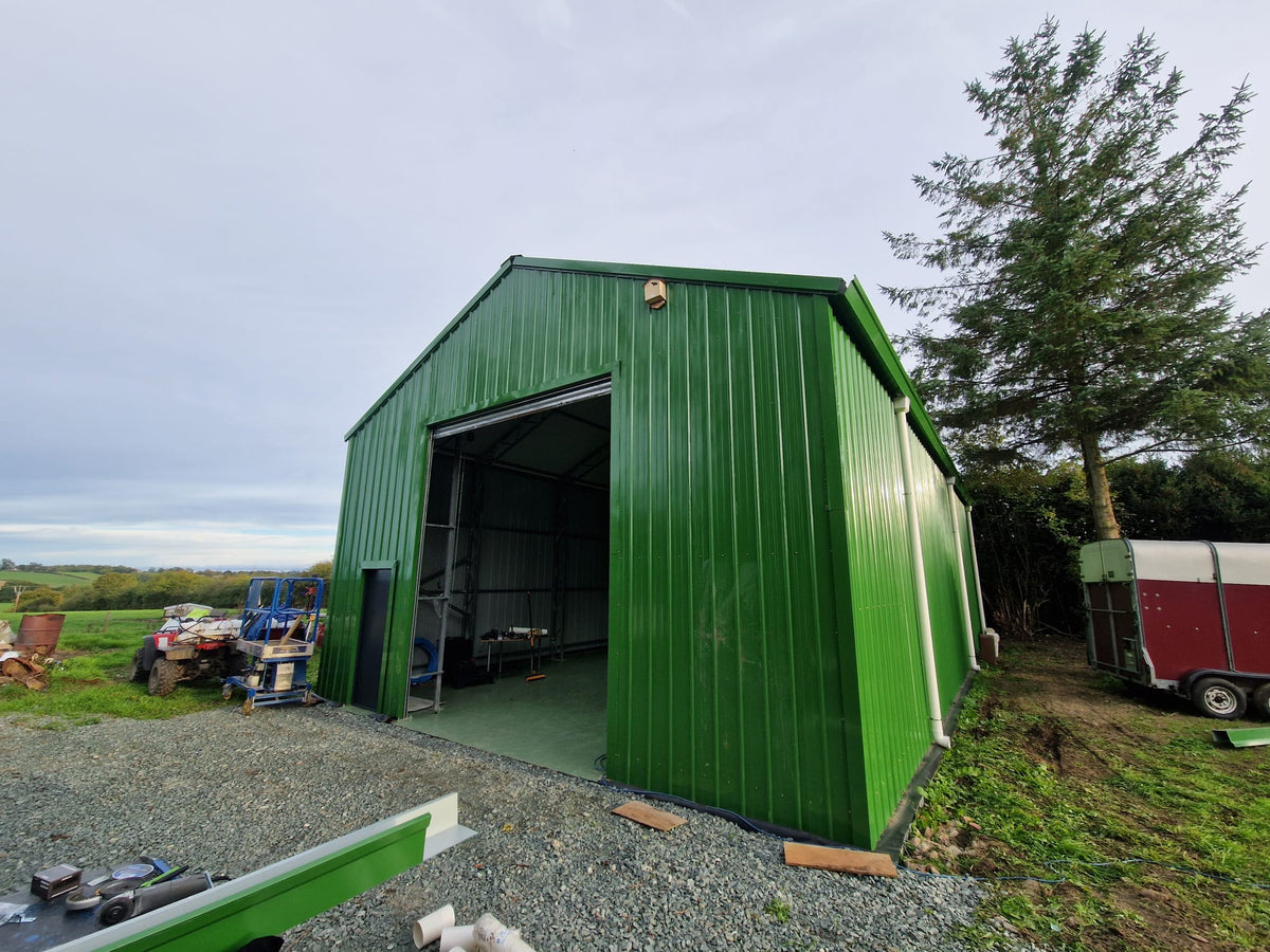
In the Field: Blending Into the Landscape
The requirement on agricultural and rural sites is often the opposite. Rather than standing out or asserting a brand presence, the goal is to sit quietly in the landscape — to have a building that reads as part of the farm rather than an imposition on it.
Green tones are the obvious choice for rural settings, allowing a fabric building to blend into fields, hedgerows, and woodland backdrops in a way that a stark white or grey structure simply doesn't. For farms in areas of natural beauty, on sites with planning sensitivities, or simply for owners who care about how their land looks, the ability to choose a colour that works with the landscape rather than against it is a genuine advantage.
It's also practically useful for operations where the building's visibility matters — livestock shelters or equipment stores on land that borders public footpaths or roads, for example, where a low-visual-impact structure is a neighbourly consideration as much as an aesthetic one.
Choosing the Right Colour for Your Setting
When thinking about colour choice, a few questions are worth working through before you order:
What's the dominant palette of the surrounding environment? On a commercial site, look at the colours of neighbouring units, boundary walls, and existing structures. In a rural setting, consider the seasonal colours of the landscape — a green that works in summer needs to work in winter too.
Will the building be seen from a road, footpath, or neighbouring property? If the building has significant visibility beyond your own site, the colour choice has a wider impact than just your own preference.
Does the colour need to match an existing structure? If the fabric building is being added alongside existing steel or brick buildings, matching or complementing those tones will give the site a more cohesive appearance.
Are there any planning or site considerations? Some sites — particularly in sensitive rural or heritage settings — may have requirements or expectations around the visual impact of new structures. A sympathetic colour choice can make a meaningful difference to how a planning authority or landlord views a proposal.